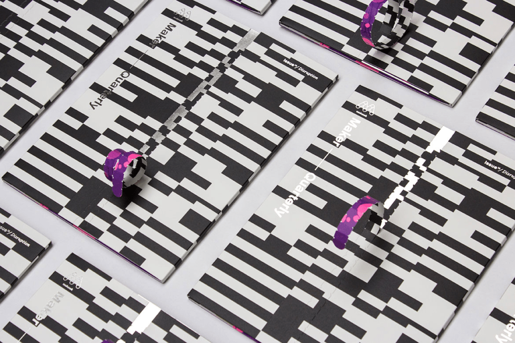
Issue 13 of the Mohawk Maker Quarterly – Disruption
The word disruption is one of those words greatly overused in the English lexicon today. So it’s understandable if one rolls their eyes at the use of it. Yet, the creative community is filled with makers and thinkers who befit the term. Their work is reshaping and upending the status quo. By definition disruption refers to a disturbance that interrupts an event, activity or process. When thinking about it in those terms, it’s easy to see why the team at Hybrid Design selected it for issue thirteen of the Mohawk Maker Quarterly – Disruption.
If you’re familiar with the Mohawk Maker Quarterly then you know each issue revolves around one word to serve as the framework for each publication. Issue thirteen contains content meant to inspire exploration in a thought provoking manner – which includes engaging content and thoughtful design, on paper.
“Let’s shed our assumptions about disruption and get back to its fundamental concept: that opportunity often hides in plain sight. Disruption happens when we pay deeper attention to what we think we know,” says Dora Drimalas, Principal of Hybrid Design. “Disruption is sudden and unexpected – that’s what makes it so powerful. And it’s ephemeral – disruptive ideas and products eventually become ordinary, so enmeshed in our culture that we can’t remember life without them.”
PRODUCTION DETAILS
Everything about issue thirteen fits within this concept. From the moment the recipient engages with the piece, they experience disruption. At a size of 9 ¾” x 13 ¼”, the format accommodates perfect-bound pages with seam binding tape to be affixed to the cover. The cover serves as a protective carrier and features op art design accentuated with mirror foil. Finally, the bindery techniques. Running vertically edge to edge is a zip-strip, so the reader literally has to tear open the piece to gain access to it.
Inside the piece is a pocket which contains a 9” x 12” art print. Using HP Mosaic randomization software, they created 20,000 one-of-a-kind, numbered art prints imaged on Superfine Eggshell i-Tone and printed on an HP Indigo 12000 press.
Accompanying it is a 5 ½” x 8 ½” zine insert produced on three distinctly different types of Mohawk paper along with four-color offset printing paired with UV white ink.
Each element in this issue could be a stand-alone print and paper demonstration.
Matching the efforts of the print production is the content within the piece.
FEATURED ARTICLES
- Future Islands by John Dugan –Repurposing America’s dying malls by bringing urbanist thinking to non-urban environments
- Art & Algorithm by Bryn Mooth –Leveraging design and variable-data technology to produce one-of-a-kind art prints
- Give it Away by Patrick Sisson –Can democratized ideation and production become a designers best friend?
- Course Correction by John Capone –How Lou Preston’s family winery evolved to become Preston Farm and Winery
- Chopped and Screwed by Erin Osmon –How groundbreaking innovation (and creative hacks) democratized music making
- Hacking Time by Caleb Kozlowski –Time is more fluid than we all realize – and we may be thinking about it all wrong
- Perfect Imperfection by Jesse Kuhn –Reframing the way we think about food with California-based Imperfect Produce
- The Movement: Look Again –Every issue we celebrate makers of all types, in this issue we chose makers whose work challenges our expectations
- Fat Tire Flyer by Charlie Kelly – The introduction of the mountain bike and how it changed the bicycle industry
FEATURED MAKERS
- Emerging Objects, 3D Printing Studio, San Francisco, CA
- Zero Likes, Visuals created by AI, @zero_likes, Sam Hains, Melbourne, Australia
- J Henry Fair, Photographer, NYC and Berlin
- Gordon Matta Clark, Photographer, New York, NY
- Flavor Paper & UM Project, New York, NY
- KUF studios, Multidisciplinary Design Studio, London, UK
- Kouhei Nakama, Visual Art Director, Tokyo, Japan
- Melissa McCracken, Artist, Kansas City, KS
To request a copy of the Mohawk Maker Quarterly, just ask.