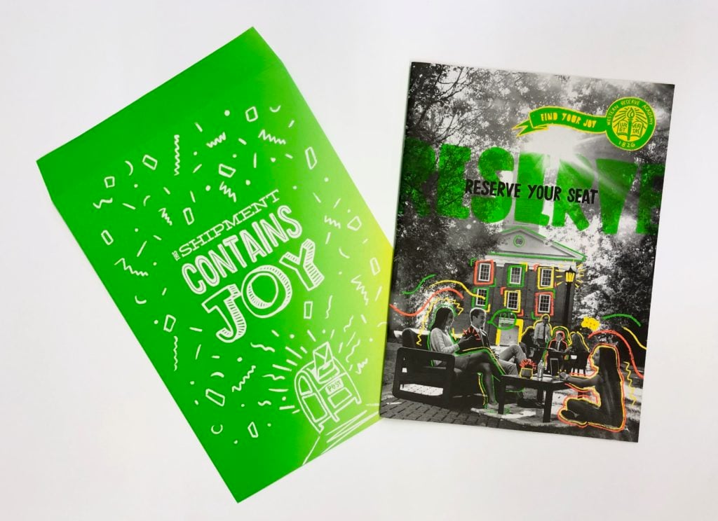
When it comes to recruiting potential students, the competition among private schools to win the best and brightest applicants is intense. To succeed, schools need to understand what resonates with its desired audience and market authentically, rather than replicate the status quo. That means creating an emotional connection through brand messaging in a way that excites and engages its audience. Understanding this concept is one thing, successfully executing it another. The Western Reserve Academy Viewbook is a great example of both. Based on the concept of joy, this viewbook captures the school’s history, spirit and lifestyle in way that connects with both its audiences – students and parents.
Cleveland advertising and marketing agency Flourish was tasked with creating the viewbook and restructuring the brand positioning for Western Reserve Academy, a private boarding and day school founded in 1826. With a new president at the helm, Flourish helped the client shed its comfortable, conservative design, focusing instead on the new energy and vibrant campus life. The client wanted a piece that screamed JOY and would connect with potential boarding school students, communicating its understanding that they’d become their second home and family.
The design process
With the messaging down, Flourish focused on the term “joy.” What does joy look like? They began with the physical format of the piece. All their competitors viewbooks look the same in terms of functionality, format and size. Western Reserve Academy did not want the status quo.
Flourish started with the size of the piece, opting for an oversized, tabloid format. This format really resonated with the client. They loved the idea of the piece feeling like an old-school newspaper but designed in a fresh energetic way. The paper selection was a big factor. Flourish wanted the piece to feel special, not like most viewbooks in their segment, sterile and unremarkable. They also designed a guide for parents that was smaller and stitched into the viewbook itself.
The viewbook combines a mix of photography, fun illustration, and pops of neon color to communicate the theme of joy. They utilized different sizes and paper stocks to differentiate between the viewbook and parent guide. This duality works to keep the integrity of the overall design while acknowledging a shift in tone that is fitting for the parental audience.
Production Challenges
This project was subject to real-life challenges like budget, availability, and timeline. The team’s initial paper selections were not going to work within the given constraints. Flourish consulted Cleveland Corporate Solutions Group Account Manager, Christy Bennett, and explored alternative options. After a few paper samples and mock-ups, they decided on two different Neenah Paper grades, Environment Smooth in Moonrock for the oversized viewbook and companion envelope, and Astrobrights Smooth in Sunburst Yellow for the parent guide.
Working with neon inks requires a leap of faith, as it's difficult to know exactly how they will look. They worked with their print rep to test the neon inks; the second hit of yellow neon ink produced the desired results. The other issue involved the use of gradients with the green and yellow neon inks. To avoid a moiré effect, the printer used stochastic printing for the gradients, while the rest of the piece was printed conventionally.
Clearly, all the preparation, samples, and testing paid off. As with many successful print projects, the end results involve collaboration, testing, and execution of the details. The decision to print should not be dictated by budget, but rather commitment. A commitment to connecting with the audience in an impactful, meaningful, and emotional way.
To learn more about how to effectively connect to your audience through print, just ask your Millcraft rep.

