A look at The 2022 Pantone Color Of the Year - Very Peri
Rather than choose one of its existing colors for the 2022 Color of the Year, Pantone crafted a brand new shade – Very Peri. The shade has a touch of complexity, blending blue hues with a violet-red undertone to create a dynamic periwinkle shade meant to encourage creativity and imaginative expression.
“Creating a new color for the first time in the history of our Pantone Color of the Year educational color program reflects the global innovation and transformation taking place,” explains Laurie Pressman, vice president of the Pantone Color Institute.
According to Pantone, Very Peri represents “the fusion of modern life and how color trends in the digital world are being manifested in the physical world and vice versa.”
“As we move into a world of unprecedented change, the selection of PANTONE 17-3938 Very Peri brings a novel perspective and vision of the trusted and beloved blue color family,” said Leatrice Eiseman, executive director for Pantone Color Institute
In terms of how the new Pantone Color of the Year ties into graphic design and packaging, “Very Peri conveys a message of credibility as well as creativity. Whether appearing in a fantasy digital realm or in physical materials, Very Peri exudes a good-natured warmth that quickly engages the eye, making it an ideal shade for many applications of graphic and multi-media design, as well as packaging."
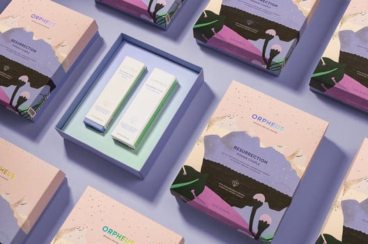
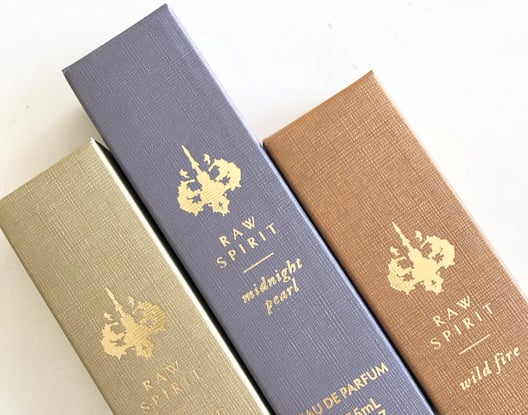
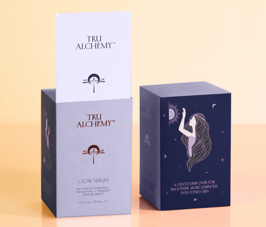
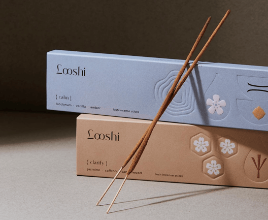
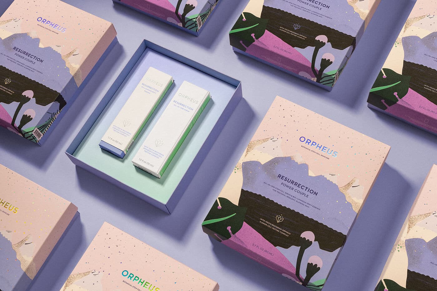
If you're looking for a little inspiration for how to use Very Peri in your next print or packaging project, here are a few examples.