Digital printing has advanced quite a bit since its inception. Today’s options are numerous, and advances in technology make it a top choice among marketers and designers. Having options is great, but keeping pace with all the capabilities can be overwhelming. While there is no one way to print digitally, there are some commonalities. Here are some of the basic design considerations for digital printing.
Solid Coverage
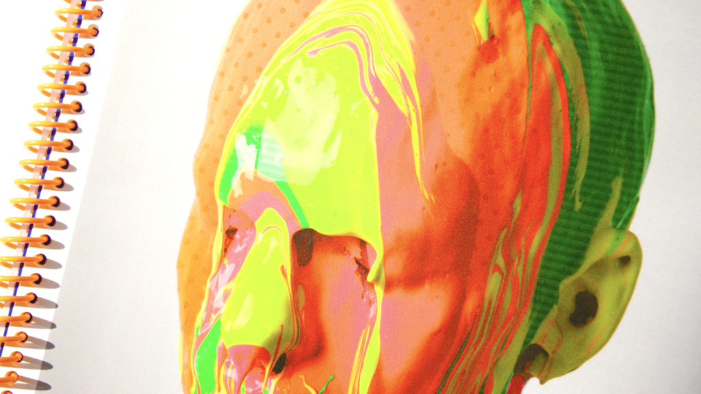
Truth be told, areas of solid colors when printing digitally can be a challenge. And depending on the equipment and color, success can vary. With digital printing, areas of solids can be prone to streaking or banding.
This can be avoided by adding type, line art, illustration or “noise” to the block. Alternatively, a monochromatic overlay, dithered bitmap image or random speckled pattern (similar to mezzotint) can help.
The same rule of thumb applies to gradients, which can suffer from banding when printing digitally. In general, tints should not be less than 15% of the original color.
Before specifying any Pantone solid colors, consult with your printer to insure their equipment can accommodate a spot ink or do so knowing it will be converted to CMYK.
Type
Some small type fonts can become fuzzy and unreadable in digital printing, try not to go below 8 pt. Its always a good rule of thumb to keep fonts embedded and as large as possible for best results. When using black type, keep to 100% black type, do not specify rich black ink that will result in fuzziness.
Ghosting
Be mindful that using contrasting colors that touch may result in unwanted ghosting. This is more likely to happen when using two colors that touch without a common process color. It can also occur when using black type on a strong background color or a strong type color on and background similar in color. You can remedy this by using common process color found in both touching colors.
Paper
As with any print project, papers should be considered early on in the process as opposed to after the artwork has been sent. Attributes such as basis weight, color and finish are all subject to equipment tolerances.
In general, when digitally printing most equipment will not tolerate cover weights above 130#. The same thought should be given to the paper’s finish or texture. Many heavily embossed textured papers that are perfectly fine for offset lithography are not suited for digital printing. It’s a good rule of thumb to begin your paper search by narrowing your scope to substrates guaranteed for digital printing. When in doubt ask your Millcraft rep what paper options are available.
Many devices have physical restrictions that prevent them from printing to the papers edge. While technology is advancing in terms of substrate size, it varies from machine to machine. The most common substrate sizes today are 12” x 18”, 13” x 19” and 14” x 20”, with new equipment accommodating up to a 29.5” x 20.9” sheet. These expanded sheet sizes affords designers with even more options when it designing for digital print.
These are just a few considerations to make when designing for digital print. Advances in technology means even more options for creatives when it comes to digital printing. Sign up today to learn more about digital printing.