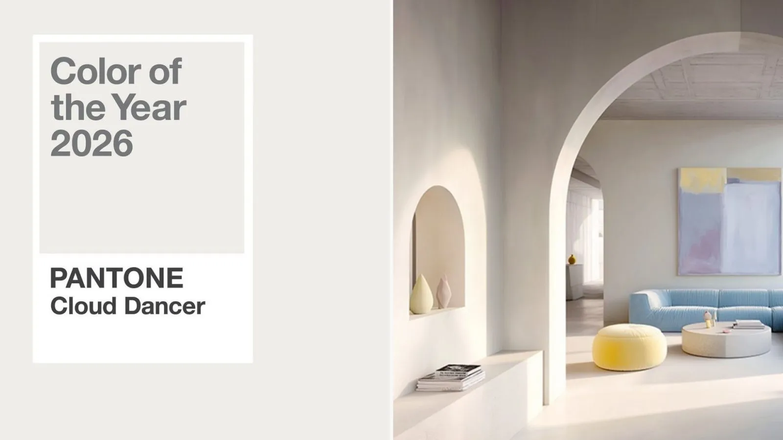
Pantone’s 2026 Color of the Year, PANTONE 11-4021 “Cloud Dancer,” is a soft, airy white that feels clean, light, and quietly comforting.
It’s not a bold statement shade. It’s a reset.
And that fits perfectly with one of the biggest ongoing aesthetics across interiors, branding, packaging, and digital design: calm, neutral-forward palettes that feel grounding and easy to live with.
Why neutrals are still winning
Neutrals aren’t just “safe” anymore, they’re strategic. In a visually loud world, softer palettes reduce clutter and create space for clarity.
Pantone’s choice reflects this cultural shift toward designs that feel lighter, calmer, and more human.
Even in home design reporting, neutral tones remain popular because they’re widely seen as calming, versatile, and timeless.
What Cloud Dancer says about 2026 design trends
Cloud Dancer supports several creative directions we’re seeing across industries:
Soft minimalism + “quiet luxury”
The look is clean, but not cold. More warmth, gentle contrast, and lots of whitespace.
Tactile, material-led design
As screens dominate, texture is back, in finishes, paper feel, matte surfaces, and subtle details. Cloud Dancer acts as the perfect base for tactile design because it lets materials do the talking.
Calm branding and wellness-coded visuals
Soft neutrals signal trust, simplicity, and ease, which is why wellness-inspired design cues are showing up everywhere, not just in “wellness brands.”
Where Cloud Dancer works best
Cloud Dancer is ideal for brands and spaces that want to feel elevated and breathable:
- Packaging: premium, minimal, and texture-driven
- Branding: clean foundations that stay timeless
- Retail & signage: open, uncluttered environments
- Digital/UI: bright, readable layouts that feel light and modern
The takeaway
Cloud Dancer isn’t about standing out loudly. It’s about creating calm through design.
In 2026, neutrals continue to trend because they offer something people genuinely want more of: space, softness, and a sense of ease.